Nectar set out to create a clear, trustworthy space in a saturated and often confusing market. The brief was ambitious: develop a full brand identity, product line, and digital presence that could grow with confidence — all within the complex boundaries of wellness industry regulations.
From labels to launch materials, every element of the brand was crafted to communicate calm, capability, and care — with design systems robust enough to carry new products, new formats, and future ambitions.
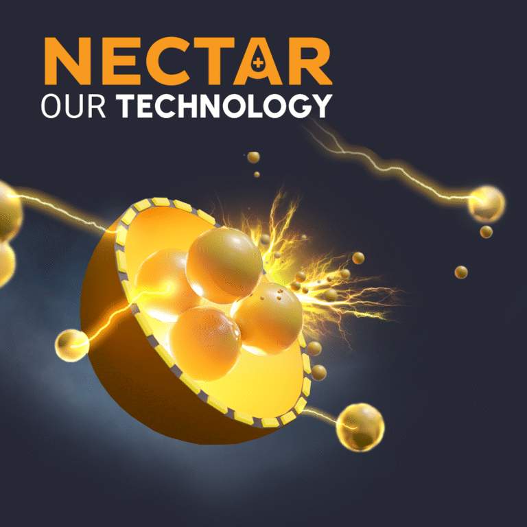
The range debuted with Nectar Oil, a fast-acting, long-lasting product built around an advanced biotech formula.
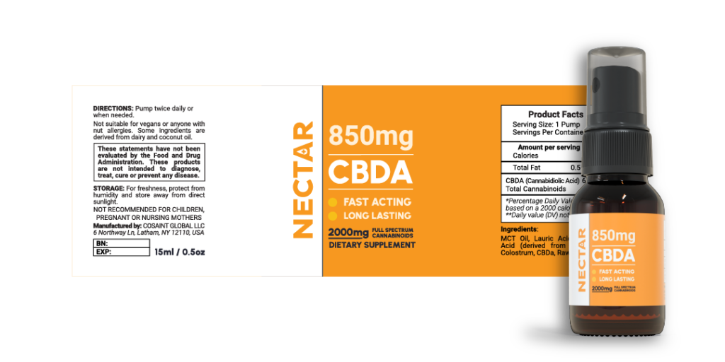
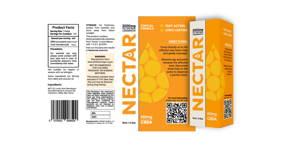
This launch established the tone for the entire brand identity — beginning with a clean, confident wordmark designed to feel modern, minimal, and adaptable across formats. Packaging design followed suit, balancing clarity and compliance with a calm visual language that stood apart in the crowded wellness space.
Social Campaigns
Beyond packaging, MW-STUDIOS developed a suite of digital and social campaign assets, translating the brand into vibrant motion graphics, campaign visuals, and adaptable templates. These extended the identity into an online space where consistency and recognisability were key, helping the brand connect with audiences across multiple channels.
Packaging & Label Design
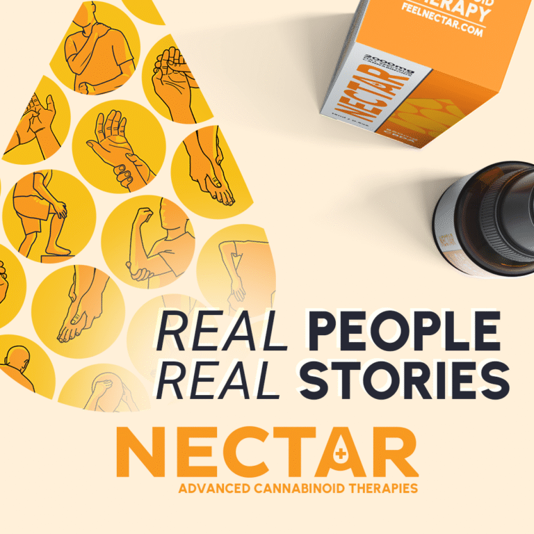
Building on this foundation, the brand expanded to include a fast-absorbing topical cream and lemon-flavoured gummies, each product carrying forward the same sense of reliability and cohesion. Together, the range demonstrated the flexibility of the design system — able to grow naturally while retaining its distinctive look and feel.
MW-STUDIOS delivered a complete creative rollout for Nectar, covering every stage of the brand’s development:
BRAND IDENTITY — logo, palette, typography, and design systems
PACKAGING & PRODUCT DESIGN — labels, 3D renders, and marketing visuals across cream, tinctures, gummies, and capsules
DIGITAL PRESENCE — website assets, social media campaigns, and branded templates